It's all in an icon: why your social visual presence matters
Last night on the way home from church I found myself waiting for the bus (not in an existential kind if way - i.e I was physically waiting for he bus) outside Holy Trinity Sloane Square, where upon I spotted the carving below adorning the gates to the building.
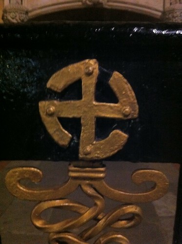
Not to go all Robert Langford on you, but this got me thinking about the importance we give to icons, logos and the visual world which we associate organisations, brands and people with. The above symbol, which many of you will first associate with Hitlers National Front, was not always a symbol of fear or ownership, but one of worship and respect (without the mass genocide).
In some cases an icon can take generations to take meaning, this was certainly the case for things like the Cross, the Buddha and the pyramid, but now new symbols can take on meaning in a matter of days.
Icons still matter an aweful lot, we are increasingly seeing a more visual web take form. Despite the constant attention given to those who can summaries there lives in 140 characters more and more imagery is filling the fibre optic veins of the web and with it comes an Internet consumer that is well versed in decoding the visual web.
Cisco recently reported that by their estimation 90% of all web traffic will be video based by 2013 and Facebook users continue to spend more time looking at photos and videos of friends than they do anything else on the platform.
So now seems like as a good a time as any to take a look at our own visual representation on the web - what images are representing your brands, your companies or even you?
3 tip to get you started:
1. Do a visual audit - a simple google image search will suffice - you'll be surprised what you find!
2. Simplify, Simplify, Simplify - if at all possible keep boiling down what images, icons, fonts and colours are being used to represent your brand - take note from some of the most notable brands out there - Facebook, Coca-cola, Starbucks - clear, simple and unified
3. Keep consistent - next time you sign up on a new service, launch a new blog or Micro site or print up new business cards keep consistent with colours fonts and logos - this may seem obvious but it can be awe-fully tempting to just bash up the first or prettiest version you have of a logo or head shot. If you want to keep consistent check out Gravatar - a system recognised by the likes of Word-press and many other social sites to ensure you use consistent profile pictures!
Over to you:
What visual identities do you think sum up their brands clearly?